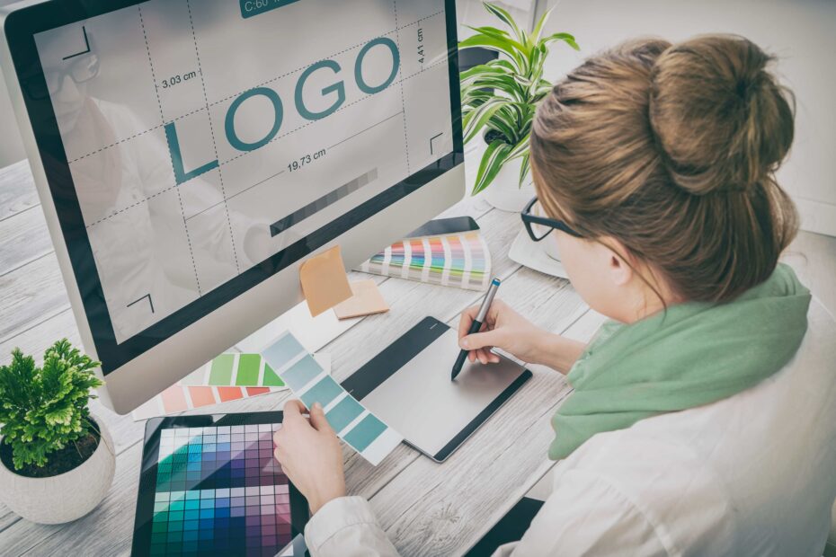
 Oscar Wilde once said, “You never get a second chance to make a first impression.” While that applies to our personal lives, it also applies to our business. The first thing potential audiences notice about your organization is most often your logo.
We all want our companies to look neat, but designing a logo is about more than that. Logos have a deeper power — they showcase what your business is about, give you credibility, and hopefully have a positive impact on your audience.
Logos affect the subconscious of consumers, who attach emotions and attitudes to company’s images. There are several ways to create an effective logo so you can make the most of your one chance to make an impression:
Your logo should communicate your identity.
It can be easy to fall into the trap of thinking a logo should come first, and then you can frame your brand around it. In fact, the opposite is true.
Before you create or redesign your logo, you should consider taking time to look at your core values (often found in your mission statement and history). You should be able to answer who you are, what the organization is about, and how you want your customers to feel when they interact with your company.
Your logo should communicate values, keywords, and other design elements that are personal to you, but will also resonate with your audience.
Your logo should be memorable.
This seems obvious — you want your customers to remember your company the next time they need your product or service. The easiest way to make your logo unique is to make the design distinct. For example, if your business sells outdoor products, don’t put mountains in your logo. REI has already done that.
How do you know your logo will be remembered? Answer this: if you replace your name with a competitor’s, would your audience know the difference? Your customers should see your logo and immediately associate it with your organization.
Your logo should be simplistic.
You can give your logo meaning and individuality without overdoing it. Think about the logo of global phenomenon McDonald’s. Golden arches in the shape of the letter “M.” It’s as simple as that, and when we see it, we recognize it.
Choose one symbol or acronym for your organization and let that be the focus. Less is almost always more!
Your logo should be right.
Take your time with the logo design and approval process. Logos stick, so you want to make sure you get it right the first time.
Sometimes it helps to bring in different people to give their feedback — think about your customers and board members, and especially your employees. Give honest feedback to your marketing team, and don’t sign off on anything until it feels right to all involved in the organization.
Need help redesigning your logo? RSPR has the corporate logo and branding services that can transform your company. Contact us today to get started.
